I still remember the first day my husband and I became empty-nesters. We went out to dinner and were literally raising our glasses in a toast when my phone rang. An unexpected problem with our son’s new apartment. Can we come over for the night?
That evening my son and daughter-in-law moved back into our guest room. After two years of hoarding their money and drinking our coffee, they finally pulled the trigger and bought their first home. Obviously, I don’t have any advice on how to evict Millennial squatters from your premises, but I can share some wonderful tips on helping them decorate on a budget …when they do leave the nest. Case in point: my kids’ seriously boring home office went from safe to stunning with just a small dose of DIY ingenuity.
(This post may contain affiliate links; as an Amazon associate I earn from qualifying purchases. See disclosure here.)
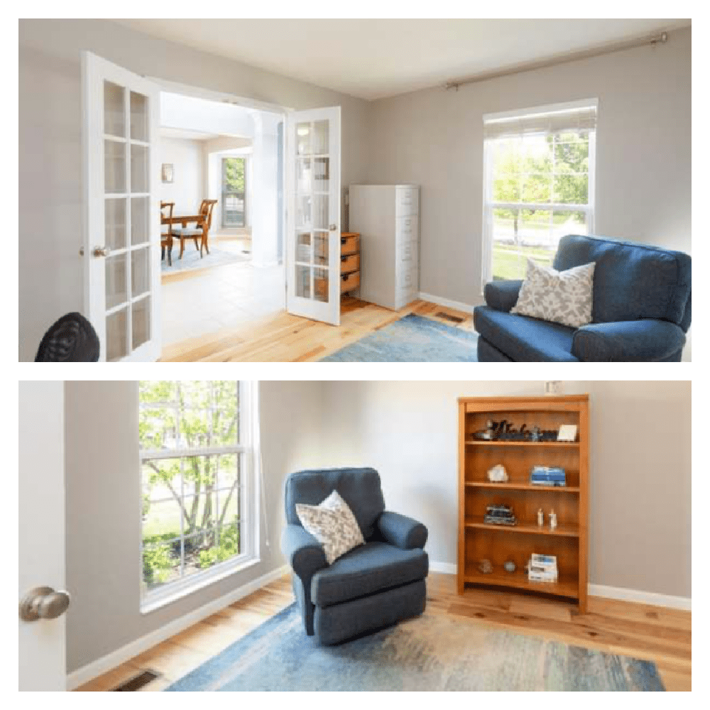
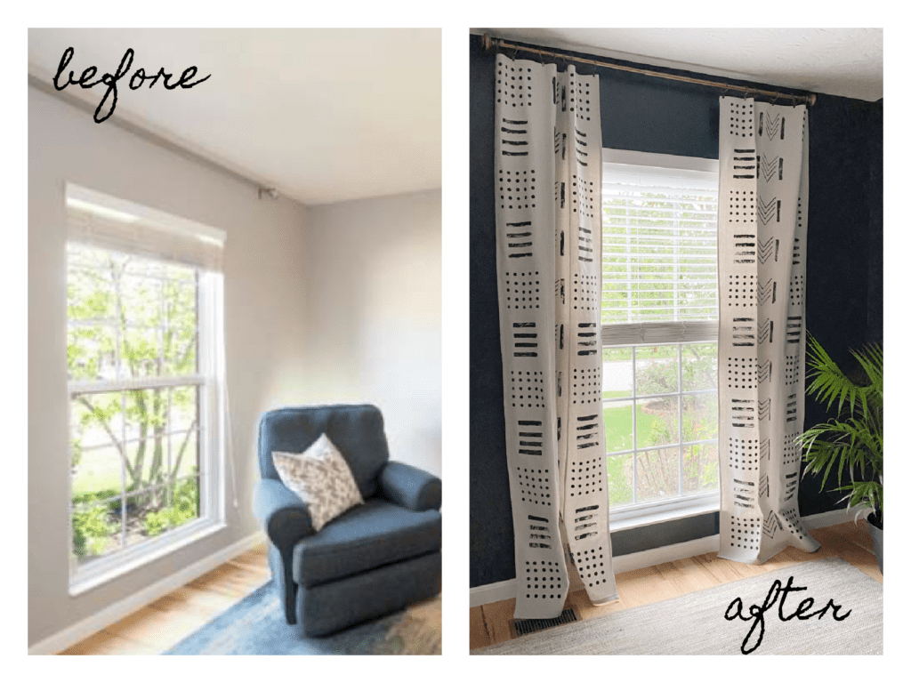
before
Before photos of the small office, as decorated by the former home owners, display neutral walls housing a few traditional furnishings. Being a southern lady, the words that come to my mine are simply “How nice.”
the plan
Although my son and his wife didn’t have many furnishings for this room, they did have a vision – a functional space for Byron’s computer, and a cozy feel to capture Lilly’s bohemian spirit. We decided three key elements needed to be included in the design.
- Dark, moody walls to create an intimate ambiance.
- A nod to Lilly’s bohemian spirit.
- An ethnic/tribal flavor which Byron loves. (Inspired by his French grandmother whose home was filled with art collected on her many travels.)
(Read more about their initial design plan in the post Week 1 – The Power of Millennials.)
the walls
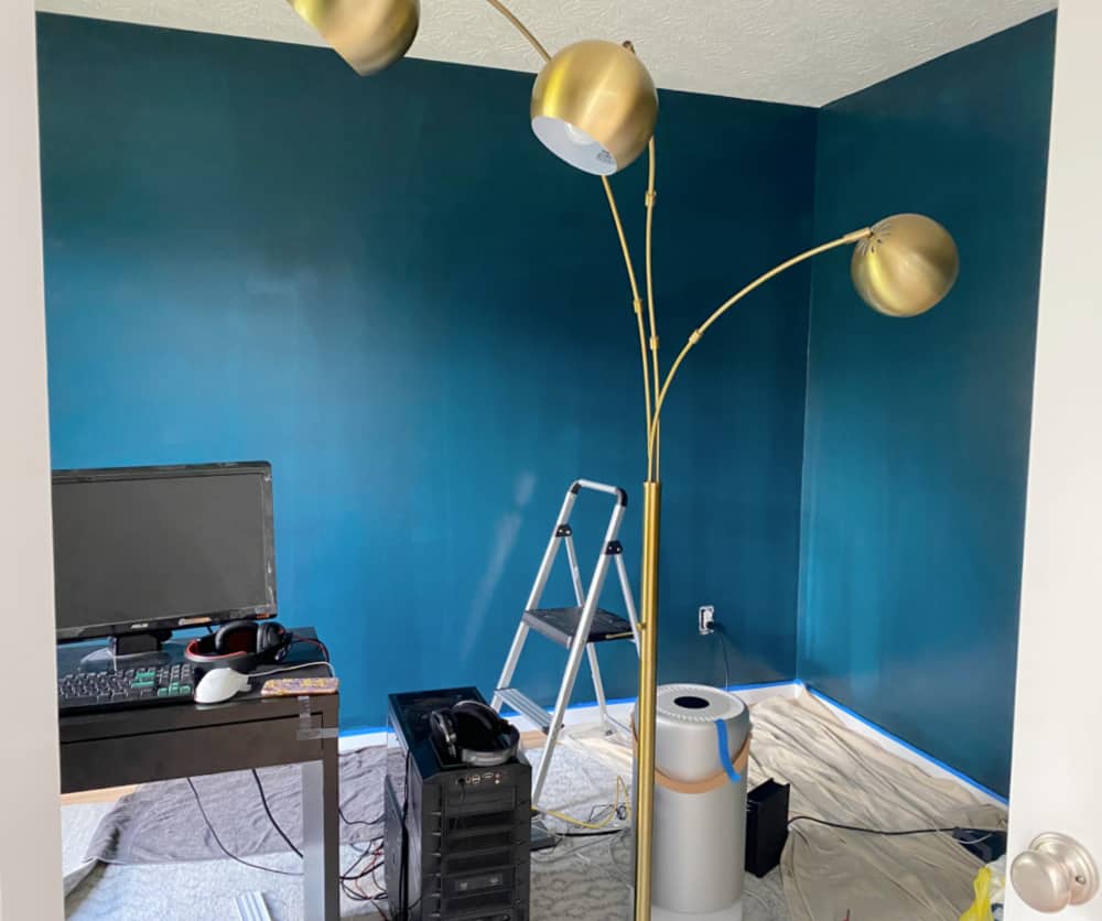
In week 2 of this One Room Makeover Challenge we focused on painting. When selecting paint, people often just ponder the color they like, when what they should be determining is the mood. Lilly envisioned this small study as a cozy retreat from the rest of her sun-filled spacious house, so we chose a very dark blue with green undertones – Sherwin Williams Dark Night.
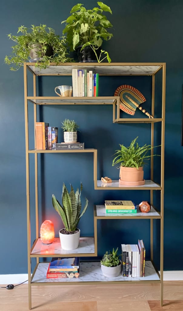
We had to borrow a floor lamp from another room while painting, which led to an unexpected revelation. Against those dark Mediterranean walls, that brass lamp just gleamed. It was then that we decided the bookcase had to be brass!
the focal point
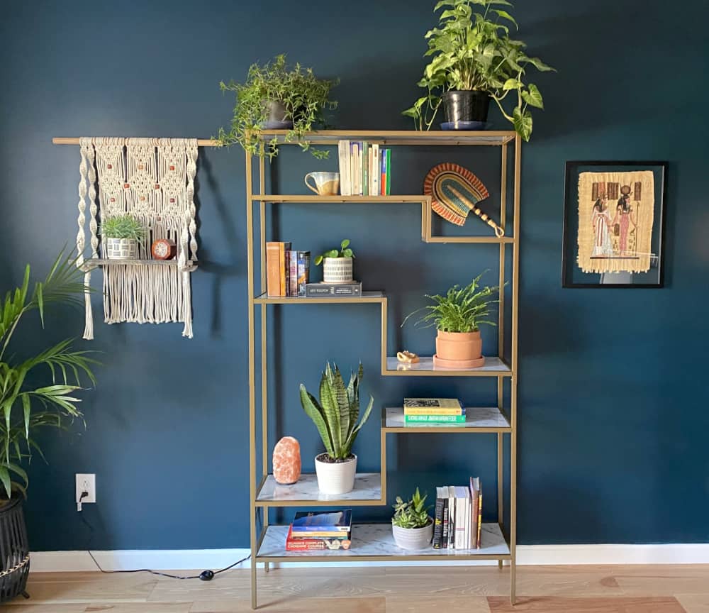
Sticking to a small budget, I found a perfect brass etagere with faux marble shelves at an affordable price. It provided the trendy boho look Lilly wanted. We accessorized it simply but used a few basic design rules to elevate it into a professional looking vignette. When placed in the center of the wall, it became the focal point of the room. Read more about the process here.
the windows
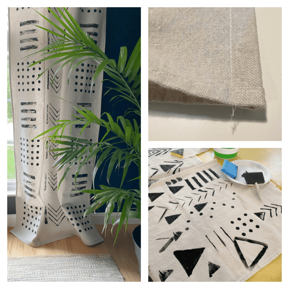
These DIY mudcloth window treatments are my favorite – a $12 investment that became the wow factor this room needed. They were incredibly fun to make and they added the perfect tribal vibe. Learn more about the project in this post.
the file cabinet
Upcycling an old file cabinet doesn’t sound exciting, but the results were adorable. With a little spray paint and some modern furniture legs, I gave this $15 flea market cabinet a sleek transformation.
the boho vibe
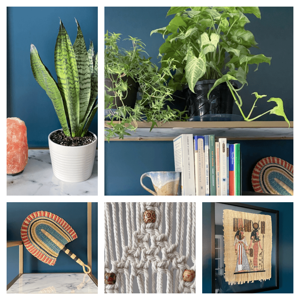
Finally, I added accessories to give Lilly the bohemian flavor she wanted. A few small plants, one large plant, and any free plants we could hustle! And, of course, I had to include a touch of the sixties with this macramé hanging shelf. (My tutorial is easy to follow.) I also added beads that complimented the tribal feel of some of the art.
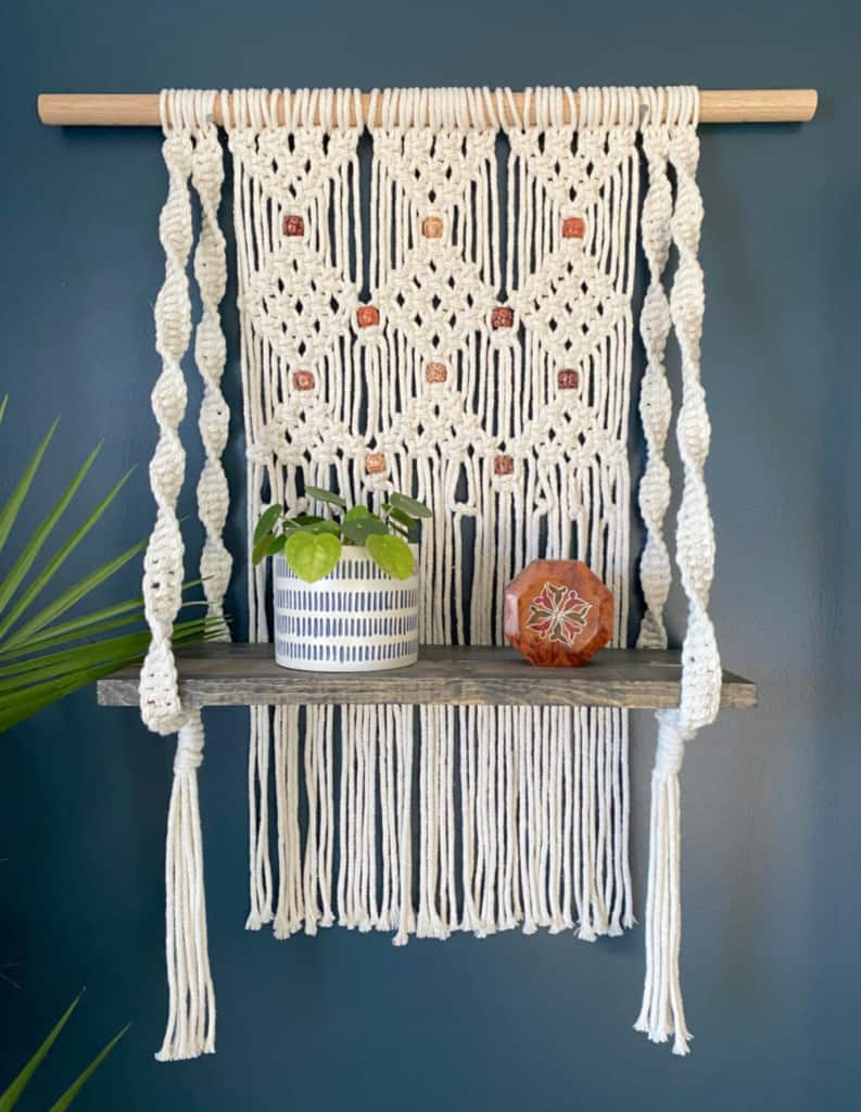
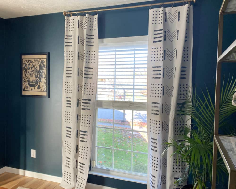
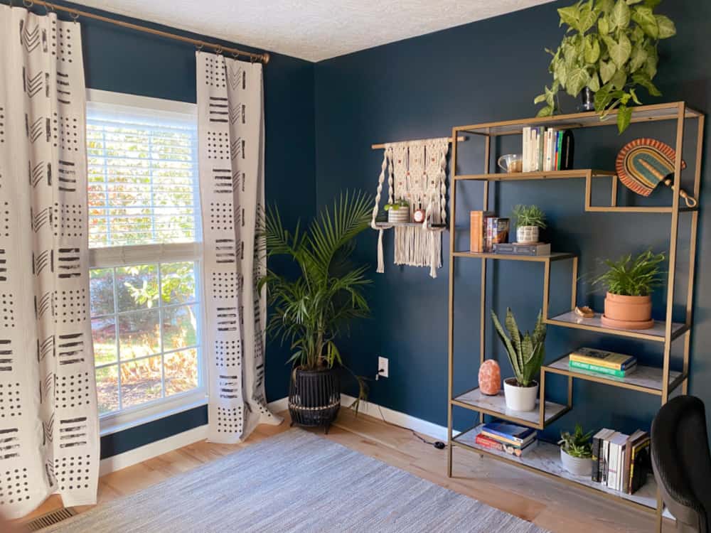
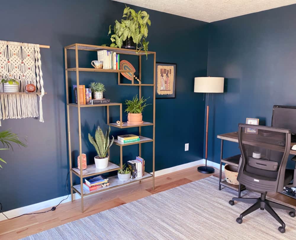
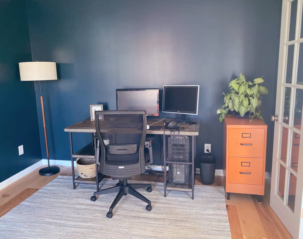
Budget breakdown: paint $80, file cabinet $15, floor lamp $75, bookshelf $250, drapes $12, rug $200, the look on my kids’ faces at the reveal …priceless. So for less than $650, I took this small study from safe to stunning, I showed these Millennials how gratifying it is to own their own digs, and I helped them move the last of their belongings out of my guest room. Now I’m off to have that toast with my husband. And my phone is turned off.
Missed my posts from previous weeks? Check them out!
- Week 1 – the power of millennials
- Week 2 – moody blues
- Week 3 – diy mudcloth curtains
- Week 4 – styling a bookshelf
- Week 5 – macramé hanging shelf
- Week 6 – file cabinet makeover
Check out the other guest participants as well as the featured designers!




Nice post. Thanks for sharing here.
Wow! It looks great!
Thanks so much!
Such a cute room! That blue has just the right zing! Great challenge!
Thanks so much, Angela.