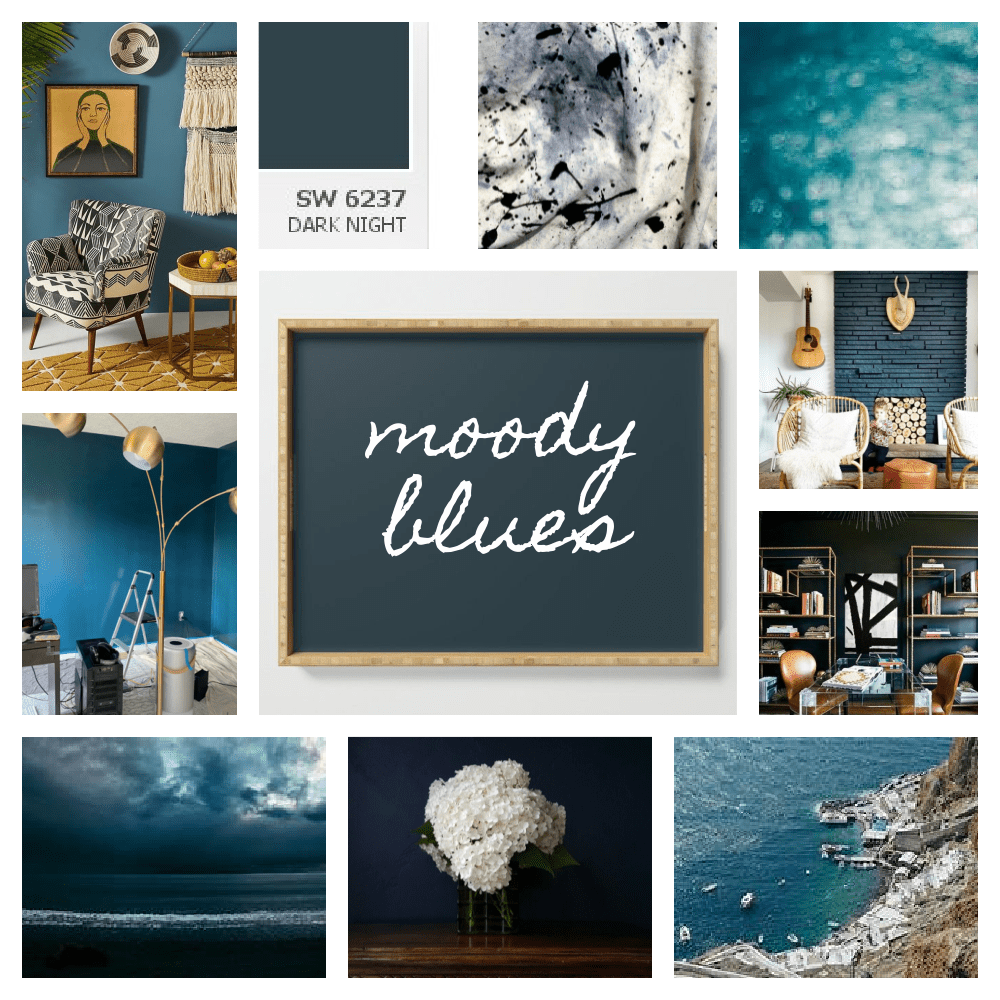
Welcome to week two of the Fall 2021 One Room Challenge. I’m excited to be a participant; come join me as I create a sweet boho study on a budget! Today is all about moody blues.
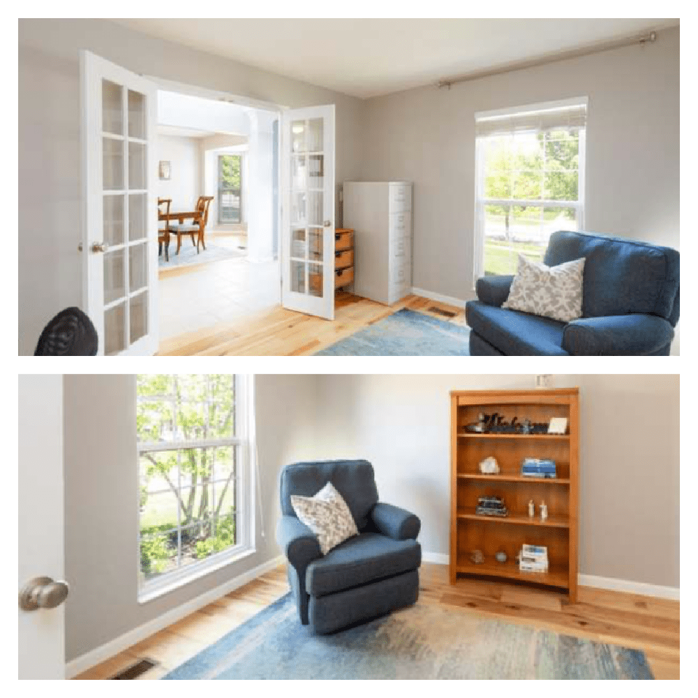
Now that my daughter-in-law Lilly and I have a plan for updating her small office, it’s time to roll up our sleeves and paint. I know, painting is not as fun as creating mudcloth drapery panels (next week’s post!) or making a macramé shelf, but it is the first and most impactful step in decorating a room. Selecting the perfect color is much harder than people think, but from the start, Lilly has been gravitating to moody blues. (The color family, not the band. But hey, let’s grab this learning moment to introduce these Millennials to one of classic rock’s greatest! Besides, once we are finished, this little hippie study will make these guys below feel absolutely at home!)

Now watch the magic begin to happen…
(This post may contain affiliate links; as an Amazon associate, I earn from qualifying purchases. See disclosure here.)
step 1 – determine the mood
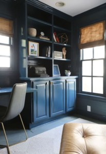
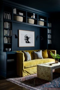
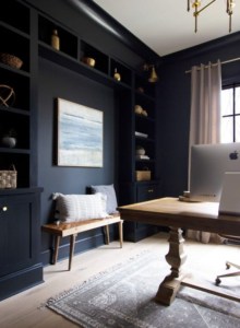
When selecting paint, people often just ponder the color they like. What they should be determining is the mood they desire. Lilly envisioned this small study as a cozy retreat from the rest of her sun-filled spacious house. A quiet and easy alcove. So naturally, a dark and moody color was the answer. From photos on her Pinterest board, it was clear she loved the feeling evoked by deep blues.
step 2 – study the undertones
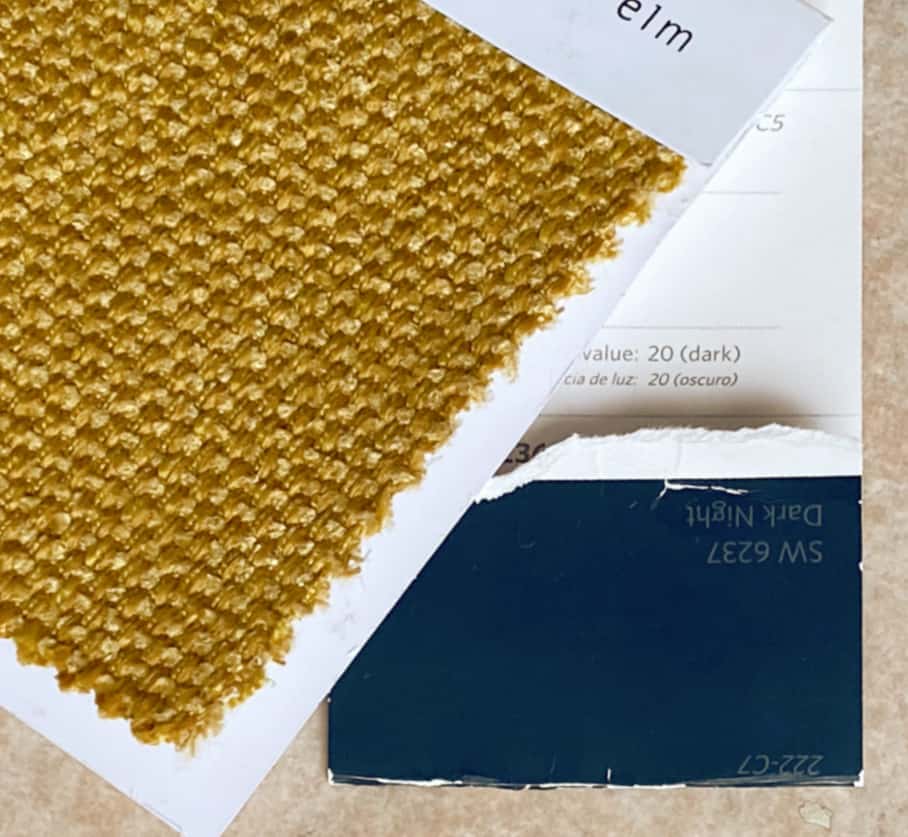
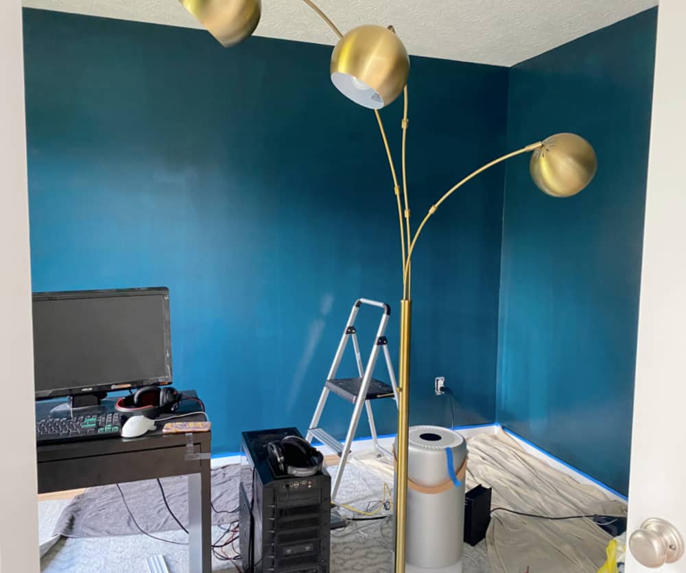
So blue it is. But it’s not that easy. Blue can run the gamut from feminine powder blues with lavender undertones to cold steel blues with gray undertones. I personally prefer blues with green undertones, as I find they convey more depth than true blues. For this room, we chose Sherwin Williams Dark Night. Don’t be afraid of how dark it looks on that tiny color chip – almost black! On the walls, it looks stunning. Deep and rich and evocative. We just love it!
step 3 – listen to the color
We were able to paint this small room with only one gallon of paint, even though it took three coats. As each coat added extra drama, we became excited to see the final result. It didn’t disappoint.
What we did next may sound strange; we listened to the color. We walked around admiring our handiwork, taking in the room as a whole. It’s so much more than just a blue room. There are nuances in the tone that spurred us to think in different directions. What surprised us most was the revelation that antique brass complimented the dark color beautifully!
Because the study has no ceiling light, we had to borrow the floor lamp from the living room while painting. Once the first coat of paint went onto the walls, that brass lamp just gleamed. Stunning against the dark Mediterranean walls.
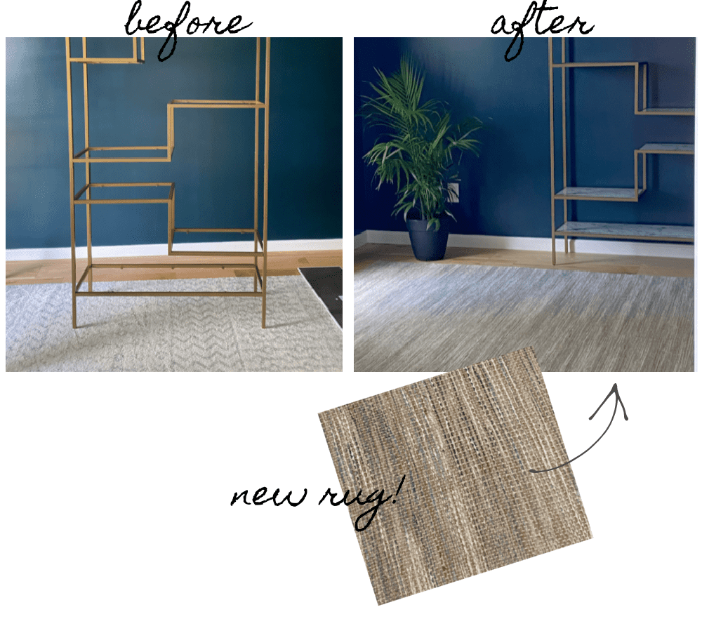
It was then we knew the bookshelf had to be brass…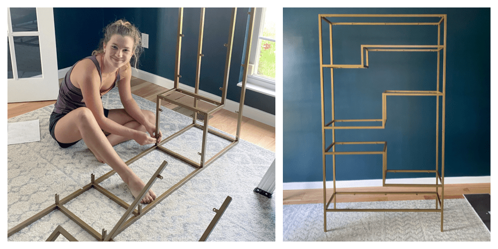
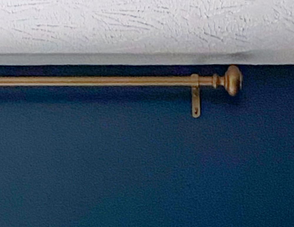
Next we decided to spray paint the existing drapery rod antique brass…
And yes, that led to the necessary decision to purchase a new rug. (That’s our story and we’re sticking to it.) We realized the free rug Lilly salvaged from my basement was a safe choice but not an exciting one. After seeing the life that brass brought to the room, we wanted a rug with warm tones. And we found a perfect solution at Target – a jute and rayon flat-weave with a warm, rattan earthy feel.
All because we listened to the color.
Missed my post from week 1? Check it out! ORC Week 1 – the power of millennials
Check out the other guest participants from Week 2 as well as the featured designers!



Love the blue color you chose! I painted our master bedroom a deep blue and there was definitely pressure to get it right! LOL. We went with Outerspace by Sherwin Williams. Looking forward to seeing this space come together!