Some things should not be over complicated. And styling a bookshelf is one of them. Welcome to Week 4 of the One Room Challenge. My daughter-in-law and I are transforming her small office into a sweet boho study, and this is the week we start accessorizing. Starting with this simple, brass etagere. If you’ve never given much thought to how to style a bookshelf, this post is a must-read. We keep it simple but impart a few valuable design rules that will help elevate any ordinary bookshelf into a professional looking vignette.
(This post may contain affiliate links; as an Amazon associate I earn from qualifying purchases. See disclosure here.)
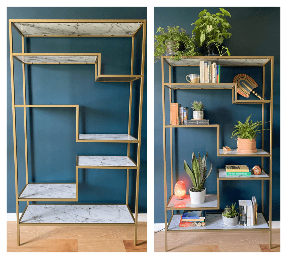
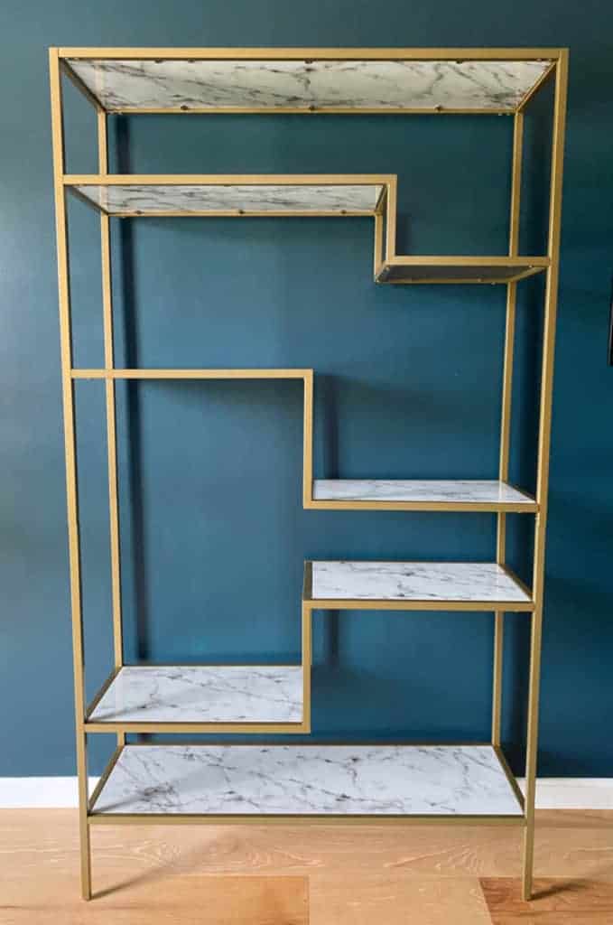
We started with a simple brass etagere with faux marble shelves from Amazon. Can you believe it? Very affordable yet it provides the trendy boho look Lilly wanted. The shelf sits in the middle of the wall, so it is the focal point of the room.
step 1 – collect your items
First, gather the books you want to showcase. This bookcase is small so we wanted to keep it minimal and clean. Lilly just gathered a few of her and her husband’s favorite novels and reference books. We then grouped them into categories.
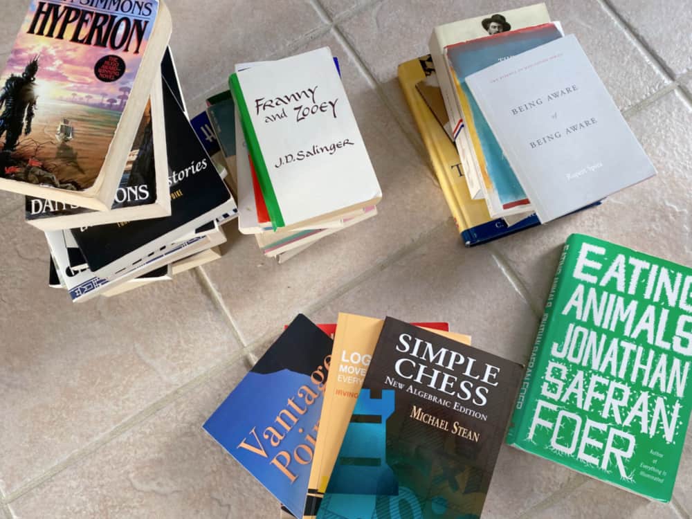
Next, Lilly dug through boxes to find any collectibles or keepsakes that may compliment the vibe of the room. And so the editing process began…
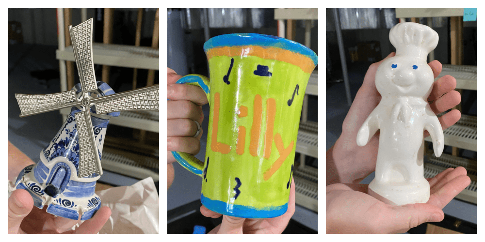
From left to right in the photos above: Windmill? Nope. Personalized mug? Sorry but no. Pillsbury doughboy? Umm, no. But wait, there’s more from her millennial treasure trove from high school…

What the hell? Guess it looks like we might have to make a run to Target or HomeGoods. We will also make a stop by Lowe’s for a few houseplants.
step 2 – analyze the space
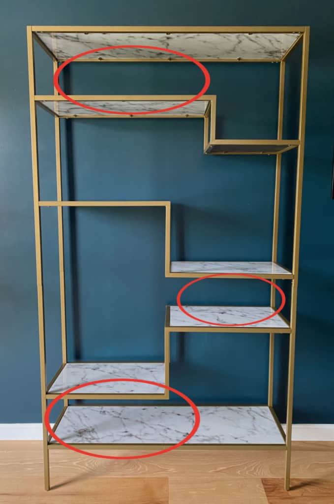
If working with standard bookcases or built-ins, this step is less important. But with a bookshelf or etagere with different sized shelves or unique spacing, it is helpful to study the spaces and devise an overall strategy. You can see from the photo below that this unit has three unique areas to consider.
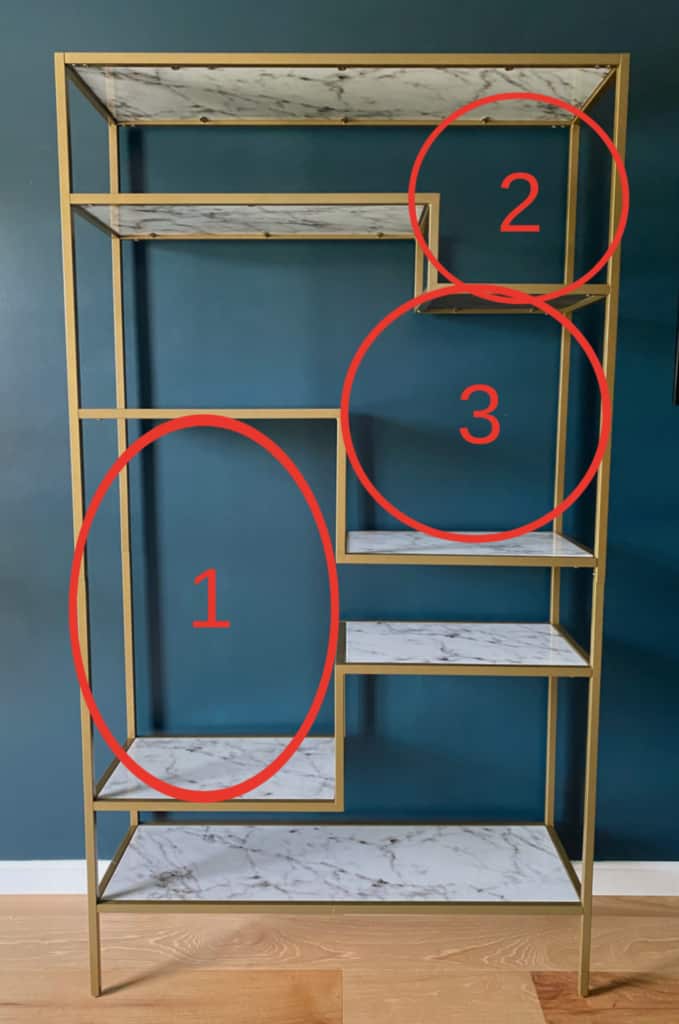
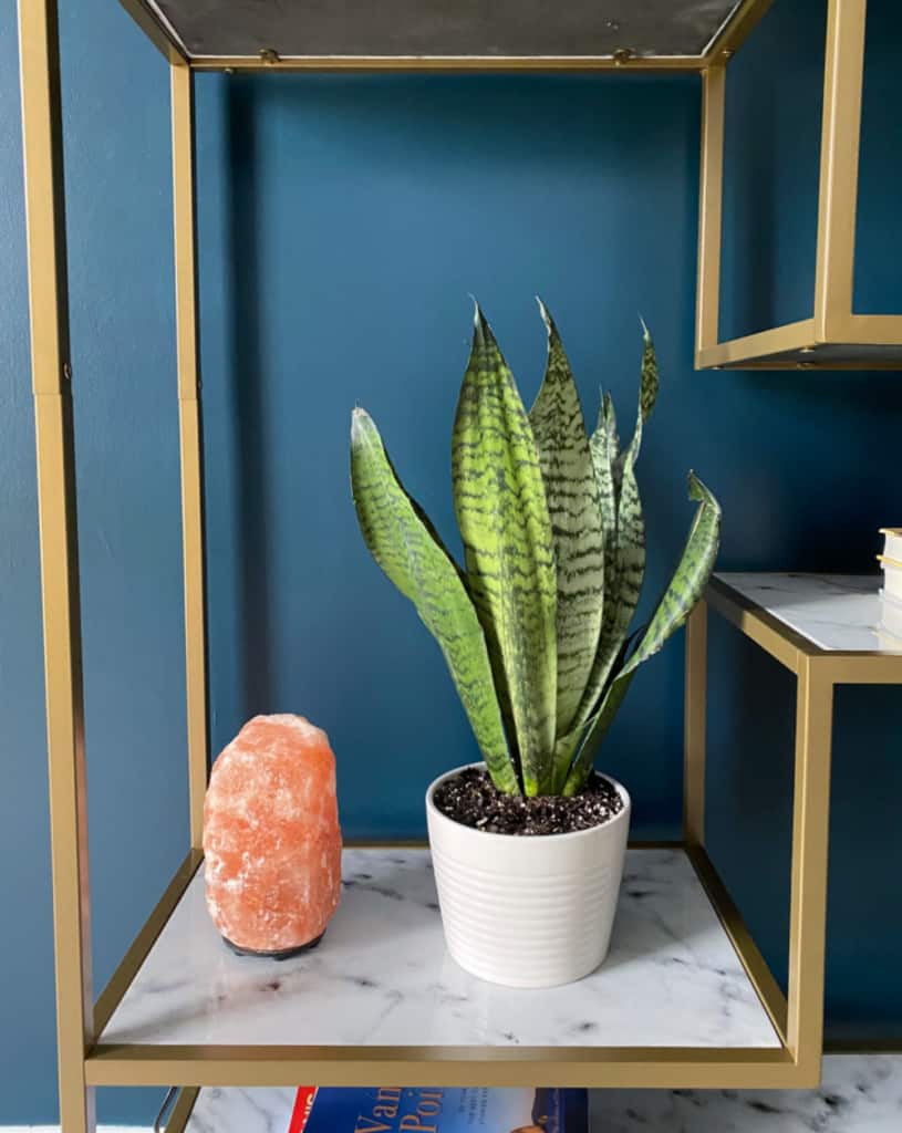
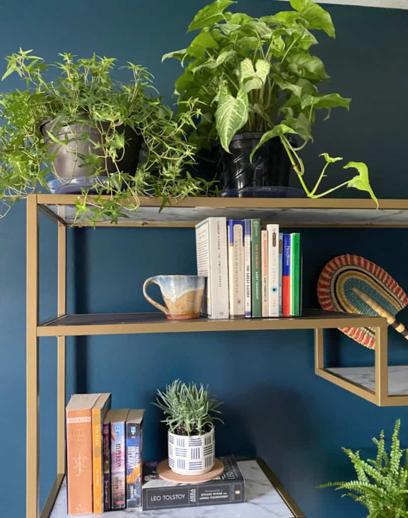
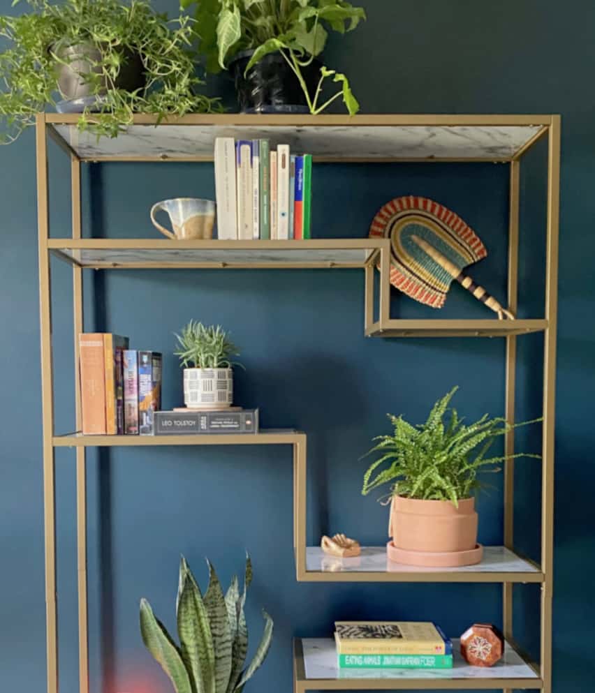
The large vertical space (1) needed something with height, so we immediately thought of a snake plant.
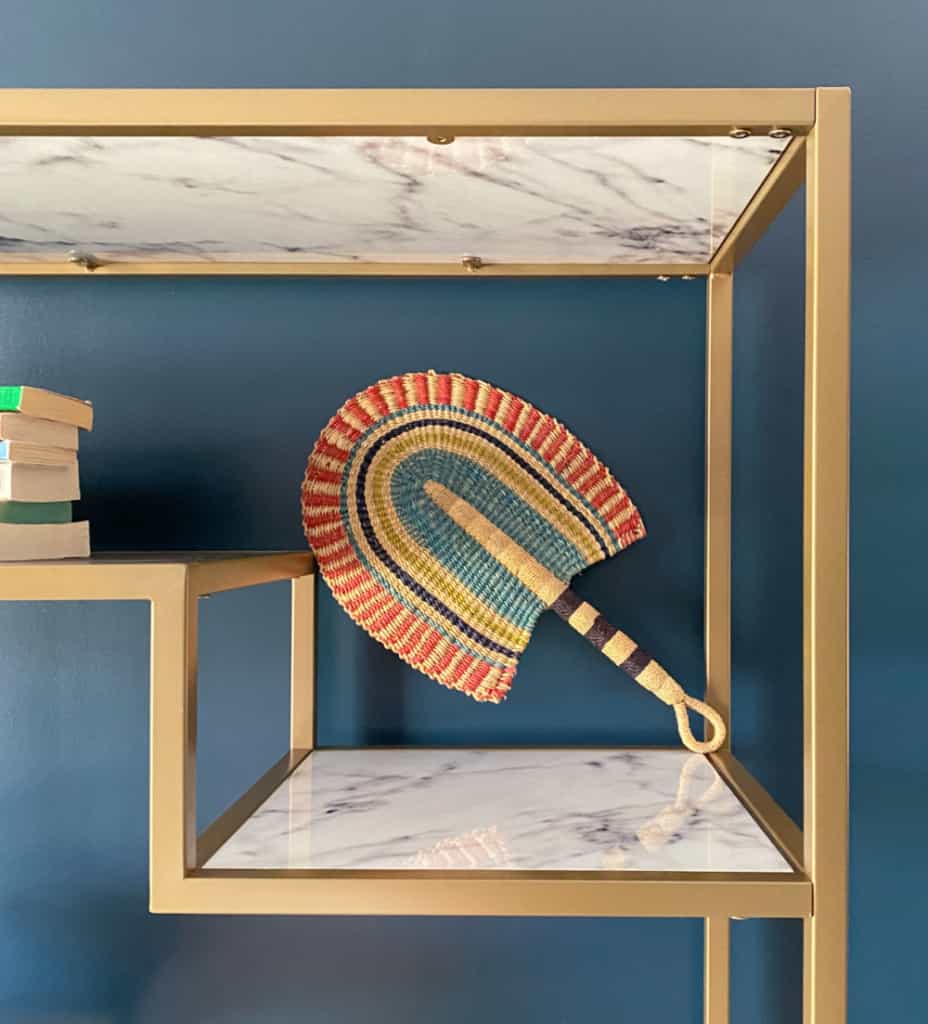
For the top space (2) we displayed a colorful Mexican fan, which perfectly complimented the ethnic, tribal theme of the room.
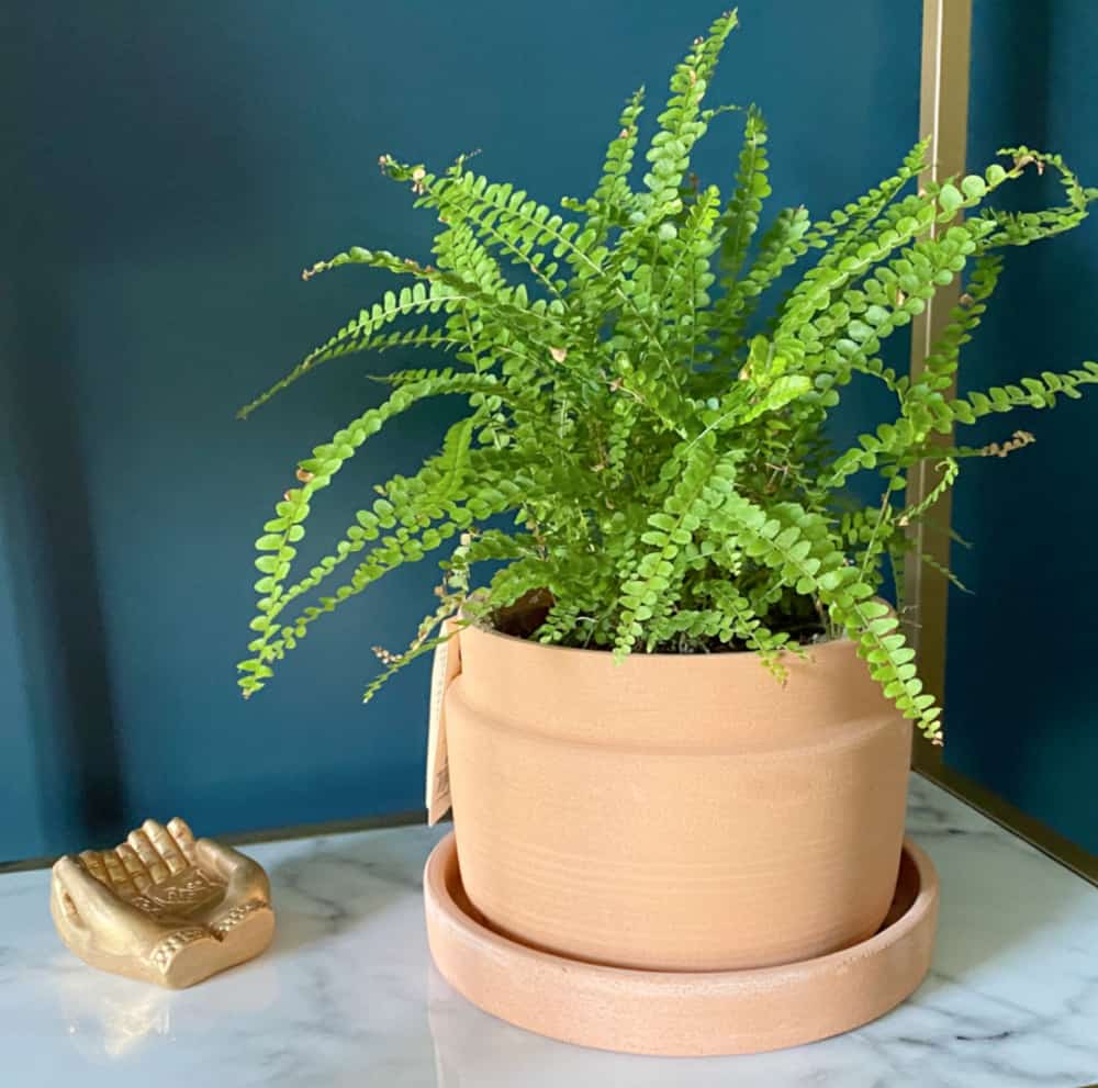
For space (3) Lilly used a plant with full, lacy leaves in a terra cotta pot.
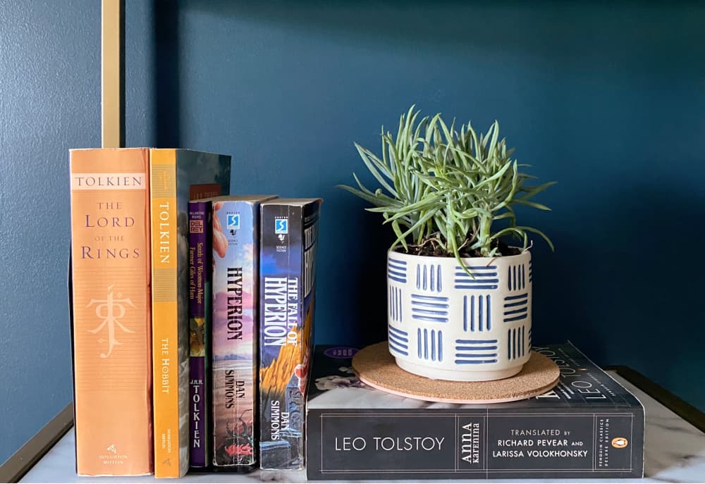
The shallow shelves are perfect for books. And remember, books don’t have to all be placed upright. Place some horizontal and mix it up!
Here’s what we came up with…
step 3 – pay attention to balance
Pay attention to balance when arranging all items – books, photos, or plants. Notice in the photo below how the plant clusters form a triangle, thus creating a nice balance.
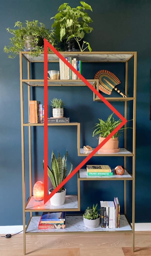
Styling a bookshelf isn’t difficult. Just pay attention to unique spacing needs and balance. And maybe don’t display every collectible from your childhood.
The biggest compliment is a little share – pin the photo below!
Missed my posts from previous weeks? Check them out!

Check out the other guest participants as well as the featured designers!


Really love this brass etagere, it’s so pretty! One of my frustrations with all of my plants on shelves is that each tiered shelf I have is the same size, so I can’t mix and match plant sizes. This etagere has different heights within each level, which is totally cool! Really great balance reminder too, with the red triangle —showing the three major points of green visual interest. I’m going to have to review each of my shelves, as I know I’m going to have to tweak them a bit after reading. Thank you for sharing your expertise!